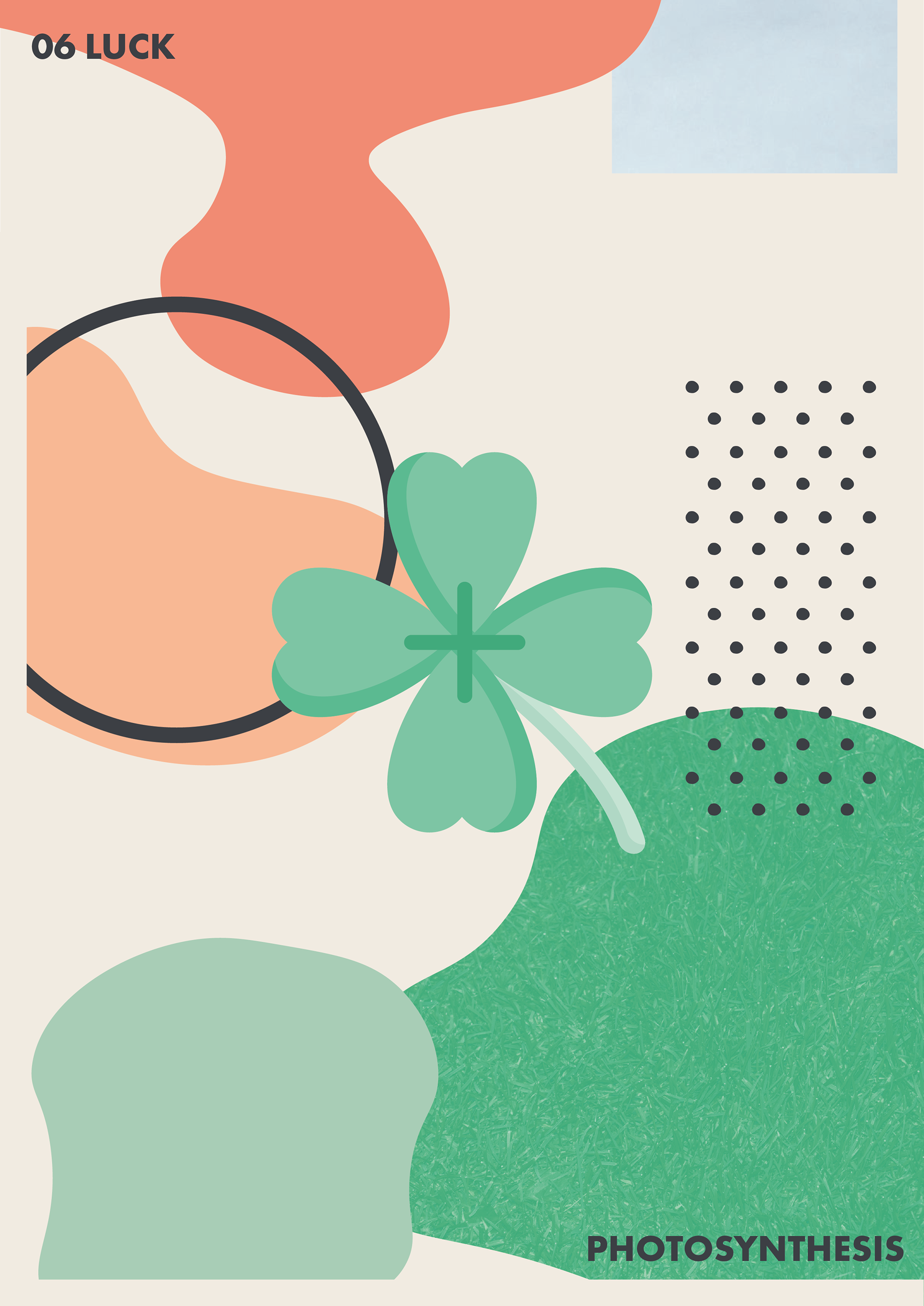
This project was to done for fun to create some more simple illustrations and bold colours which is my usual style. But I also wanted to try using textures in an interesting way. This took inspiration from ZekaDesign but our use of shapes, colours and textures are very different. My initial theme was the same but developed overtime away from the more general nature to specifically photosynthesis and the idea of the sun, the sky and nature all synergizing together.
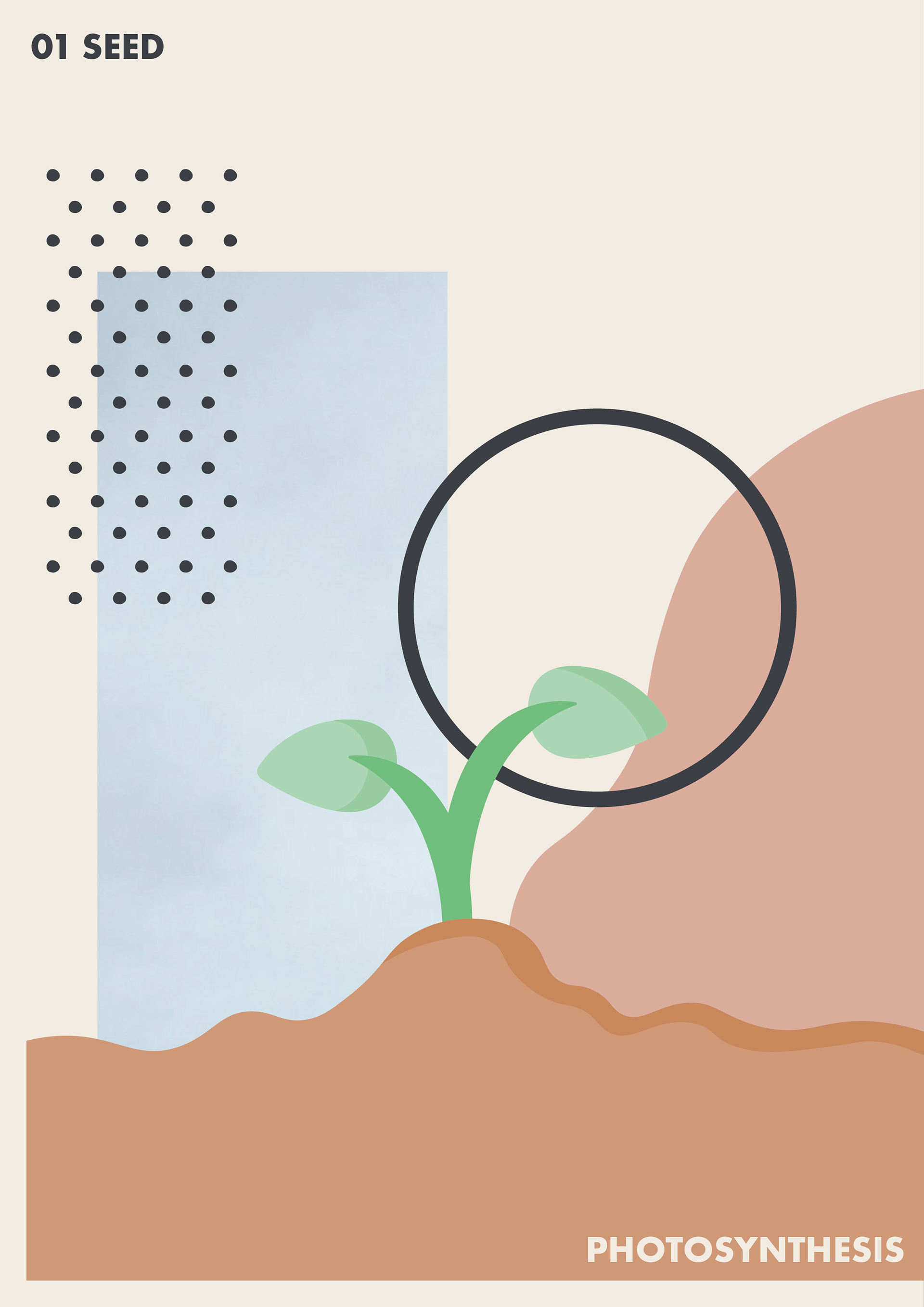
01 Seed
This was the first made and really the first place to start as a sprouting plant. I decided early on in this that I wanted the stripe of blue in the background of all of the posters. The use of this sharp retenagle to me made the perfect contrast of geometry and nature. And led to use the dots and black circle. This led my theme to shift from nature to photosynthesis in particular with the abstract sun and sky being repeated in all 6 posters.
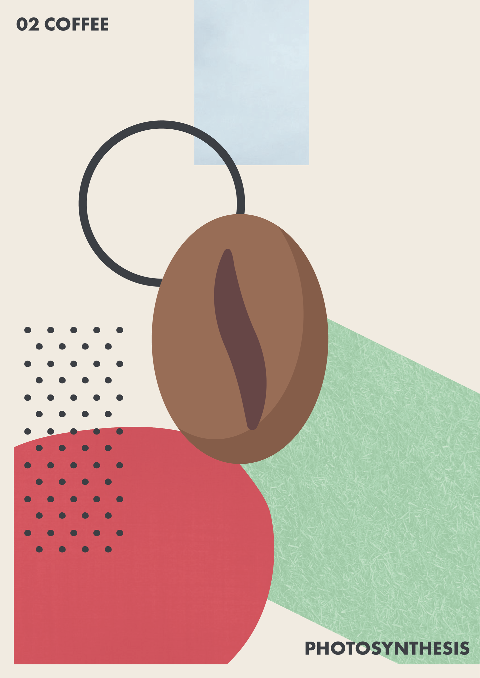
02 Coffee
The two new colours of this I decided on was red and green - representing the coffee plant and coffee berries where the iconic simple bean comes comes from. The green I decided on a grass texture rather than the plant specifically as it worked better on the large surface area and being on the ground.
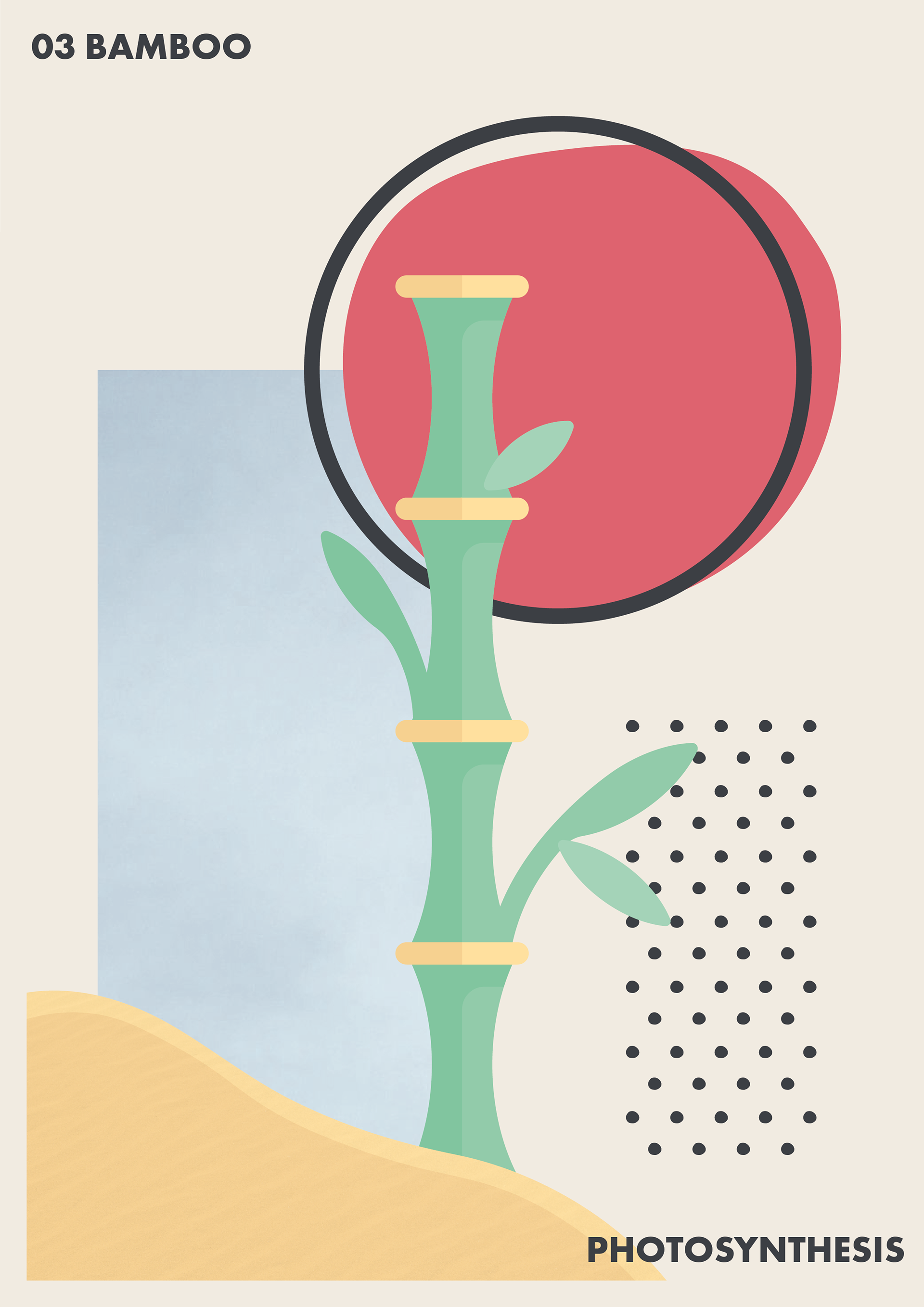
03 Bamboo
This is one of my favourites on the bunch. Though the sand is likely not accurate the colour and differing texture to rest of the posters makes it stand on it's one. The more defined late setting sun is also one of my favourite bits where I went for a more rough blob like shape of it. And representing the red sun seen in a lot of classic eastern designs, where bamboo is naturally grown.
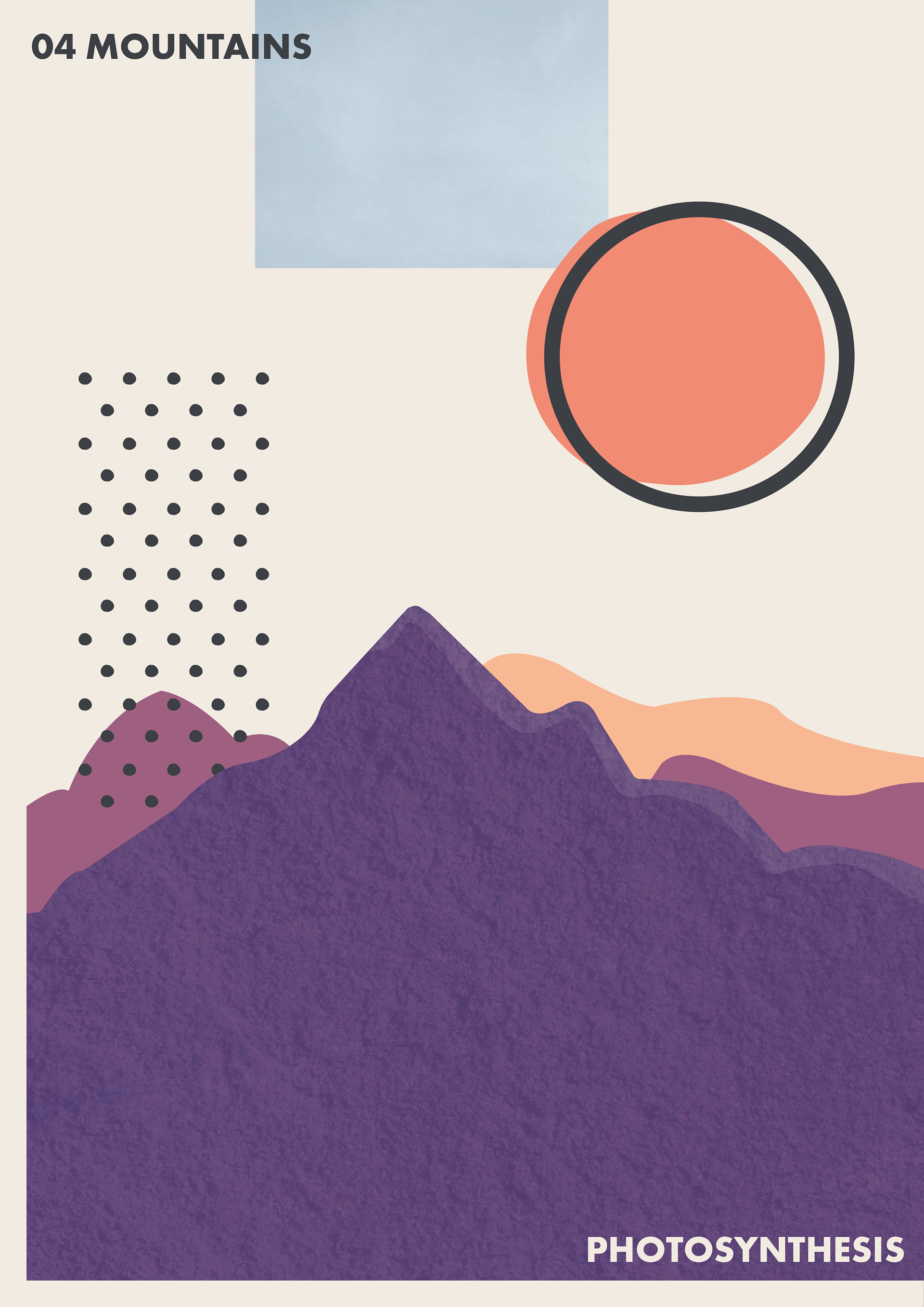
04 Mountains
After this I had to highlight another one of my favourite things in nature, mountains. This could differ to the others where the background and foreground elements link. The colour scheme for this also carries it so much - the dark mountains slowly being lit from the sunset with orange tints in the back. This also contrasts with the rising sun in the previous poster. And lastly I added a simple rocky texture to give the poster some more character.
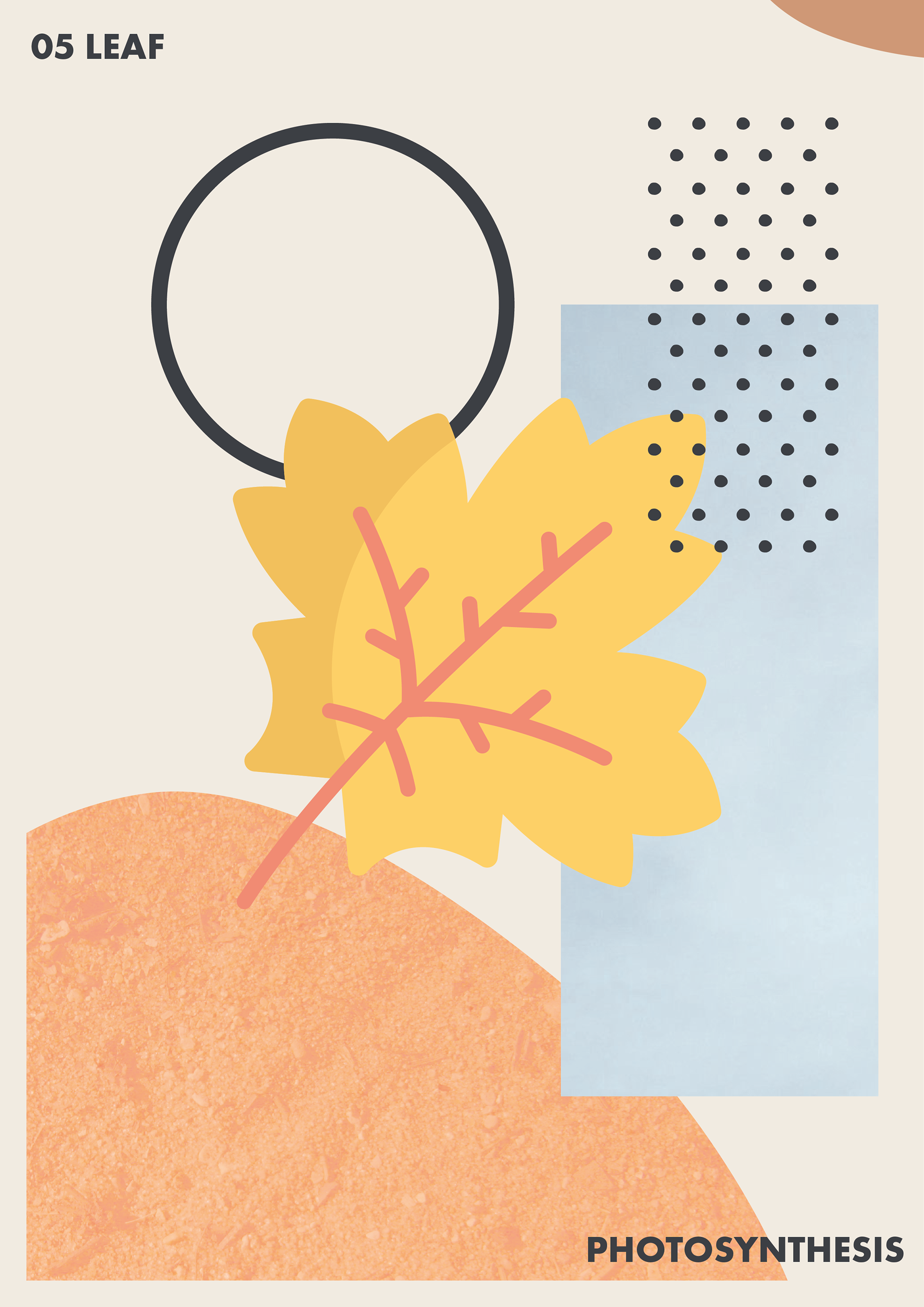
05 Leaf
Autumn is universally one of the most beautiful months in nature, and to have a nice orange centric poster was great as I noticed this was a scheme that had gone between all the posters so far. For textures I felt a simple dirt texture on the orange worked great and contrasts well with the sky beside it, letting the leaf stand above both.
06 Luck
The last poster I wanted a more simple lead design but went for the four leaf clover, a classic sign of luck. The colours here also fit with the rest of the theme as the green was the most dominant colour anyway, but I went for Ireland's flag colours of orange and green as the clover is commonly associated with them. Which also meant I could naturally contine the orange/brown/earthy tones throughout all 6 posters.


