E-quality solutions is the parent company to the four brands, and went through a re-design to better fit with the other logos, but more so to enable growth as the old logo only represented 3 companies.
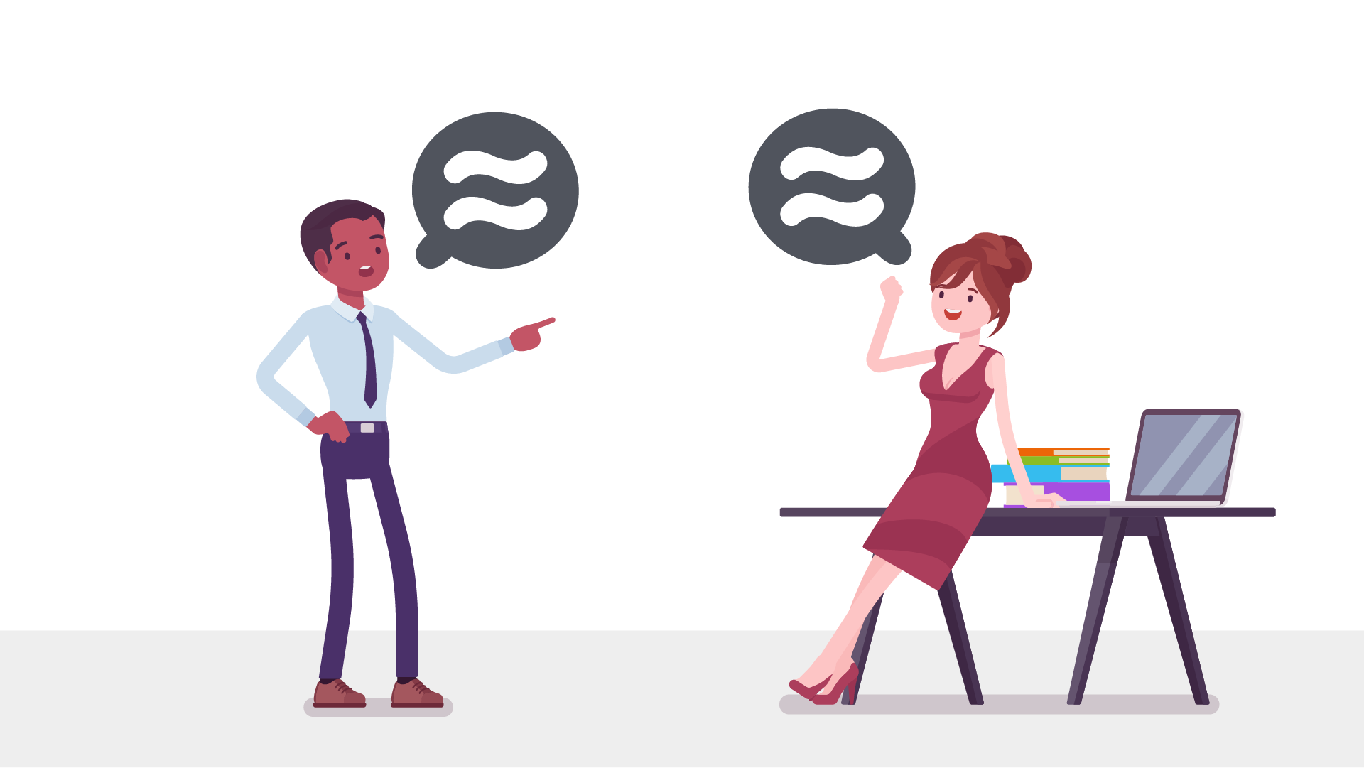
The messaging is quite threefold. The major one is the two parallel lines representing equality—One of the key aspects our company stands for and works in a field for diversity. The waves come from the prior logo which was styled that way to curve upwards to show growth. And lastly is that the Q looks like a speech bubble which upholds our group values where diversity and equality is our talking point and what we are about.
The messaging is quite threefold. The major one is the two parallel lines representing equality—One of the key aspects our company stands for and works in a field for diversity. The waves come from the prior logo which was styled that way to curve upwards to show growth. And lastly is that the Q looks like a speech bubble which upholds our group values where diversity and equality is our talking point and what we are about.
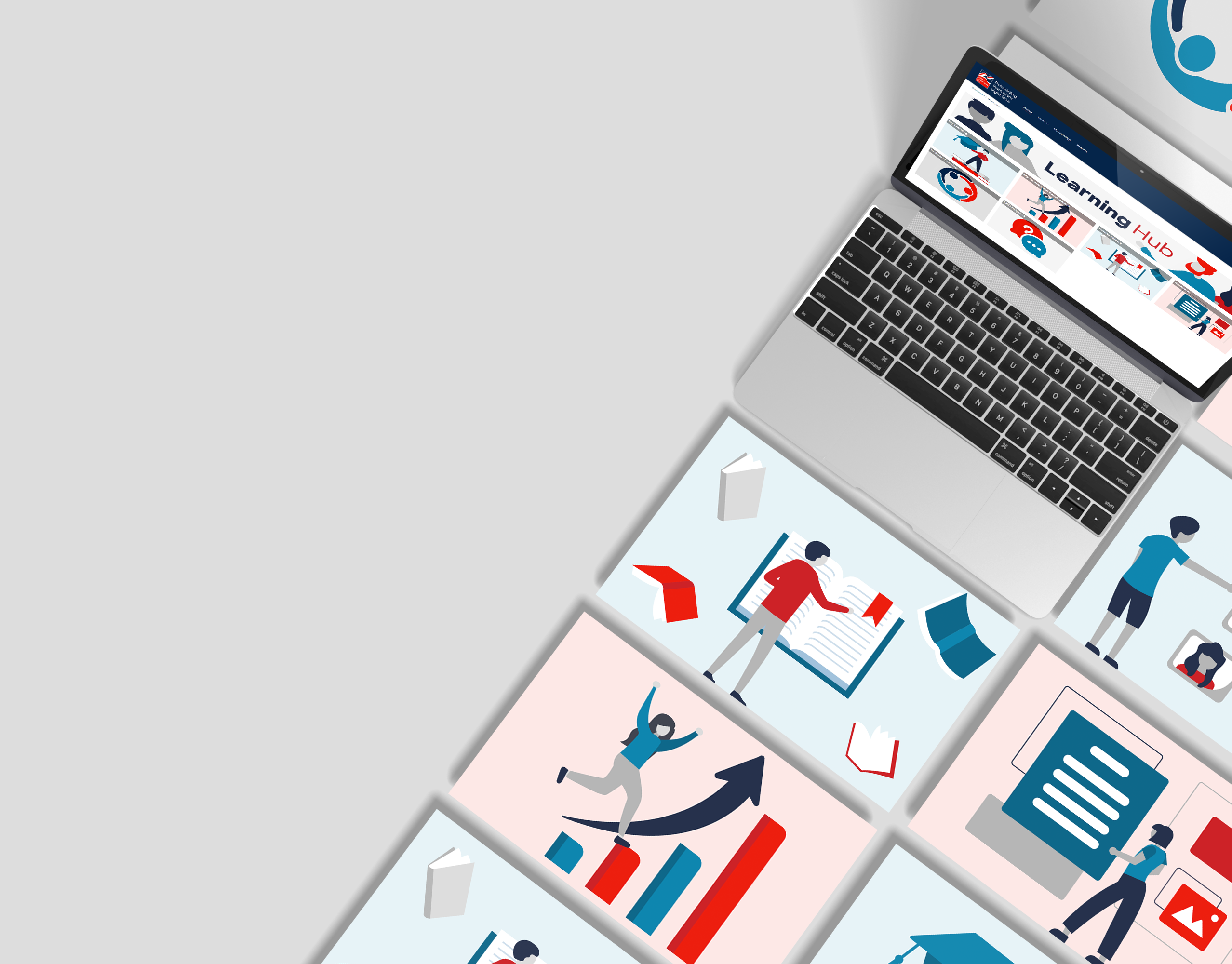
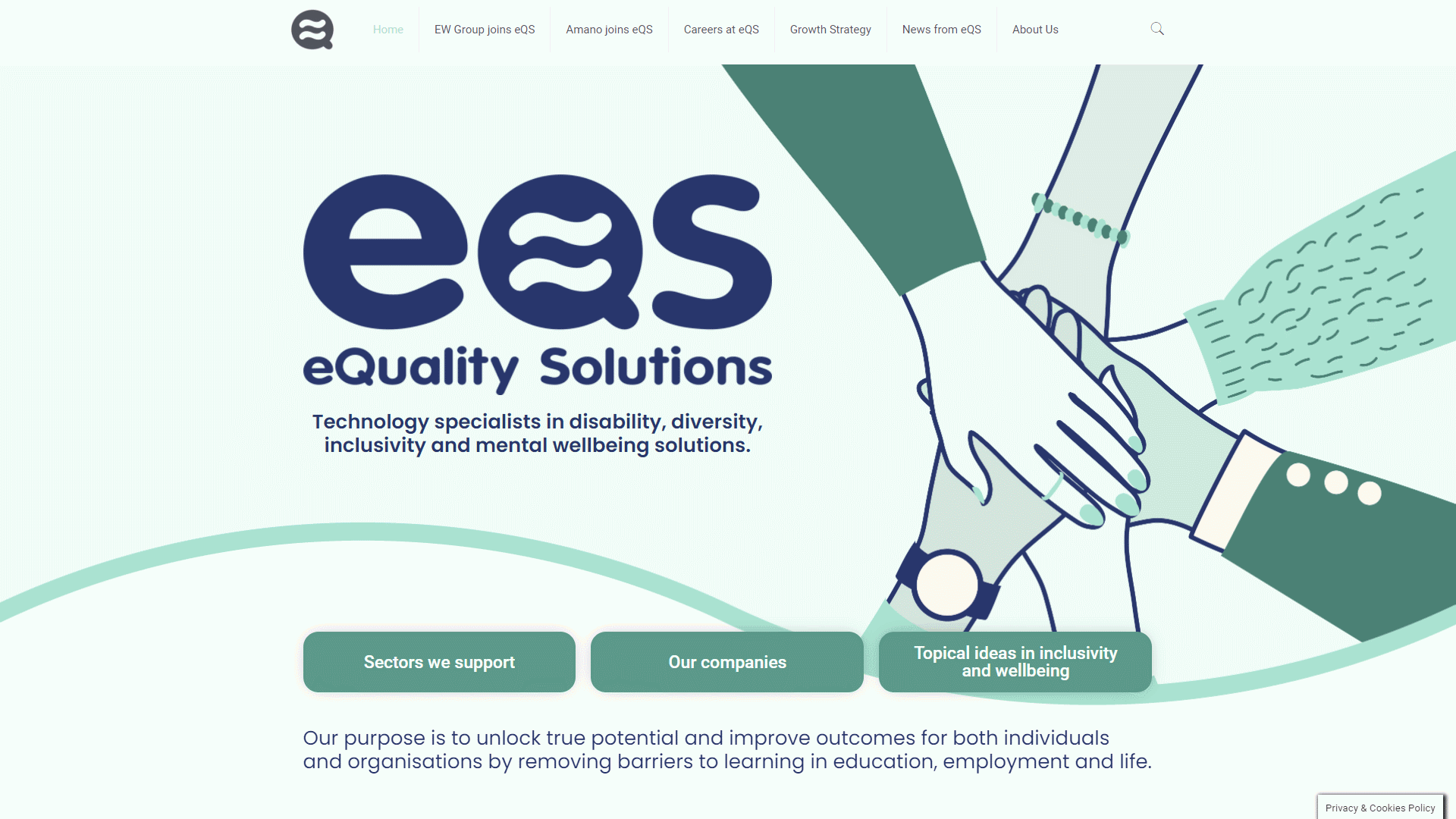
Below is a gif preview of the website I designed and built in WordPress. Everything is interactive and also includes animations which can be visited over on the website @ https://e-q-s.com
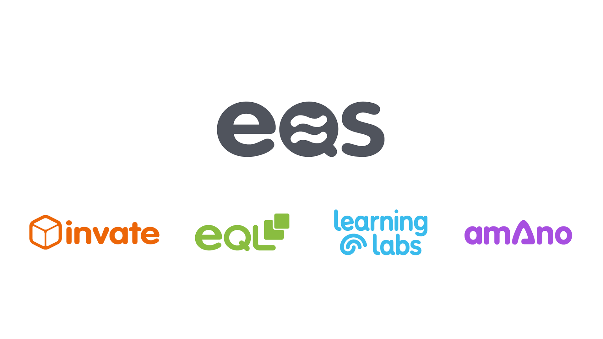
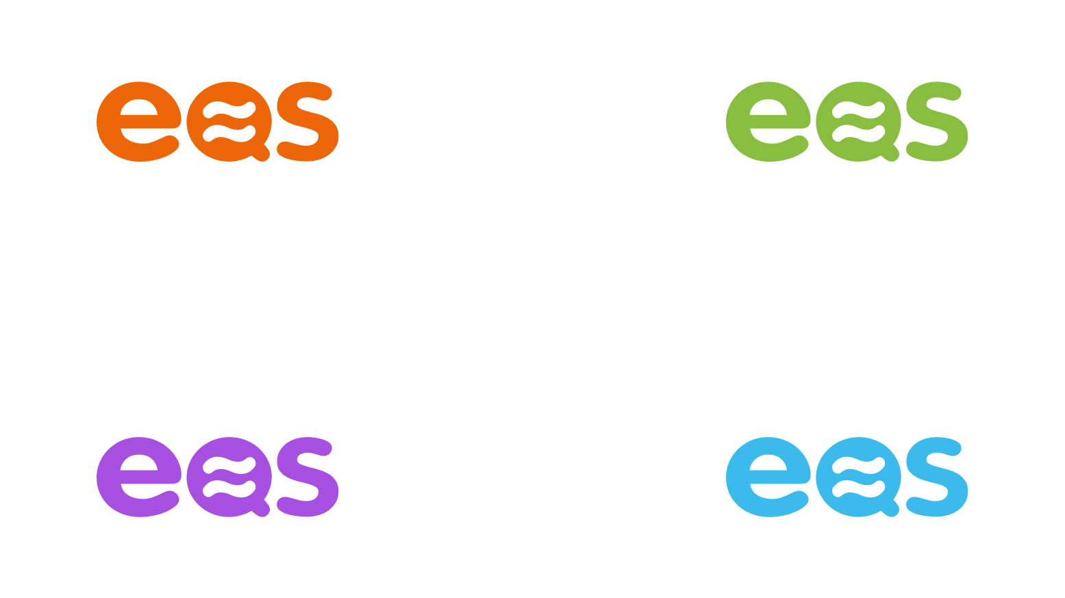
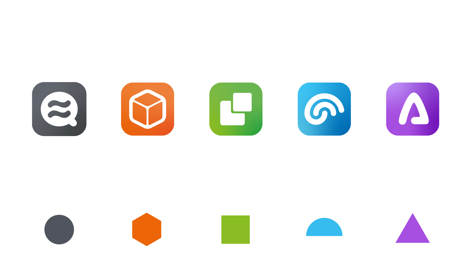
The above shows how the logo fits in the family o companies on the left. And how the logo can be used in fun, different, and colourful ways.
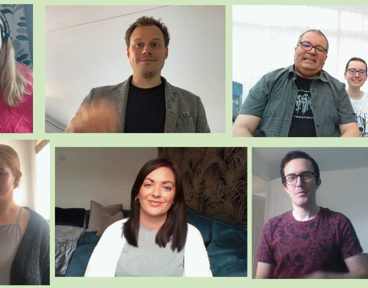
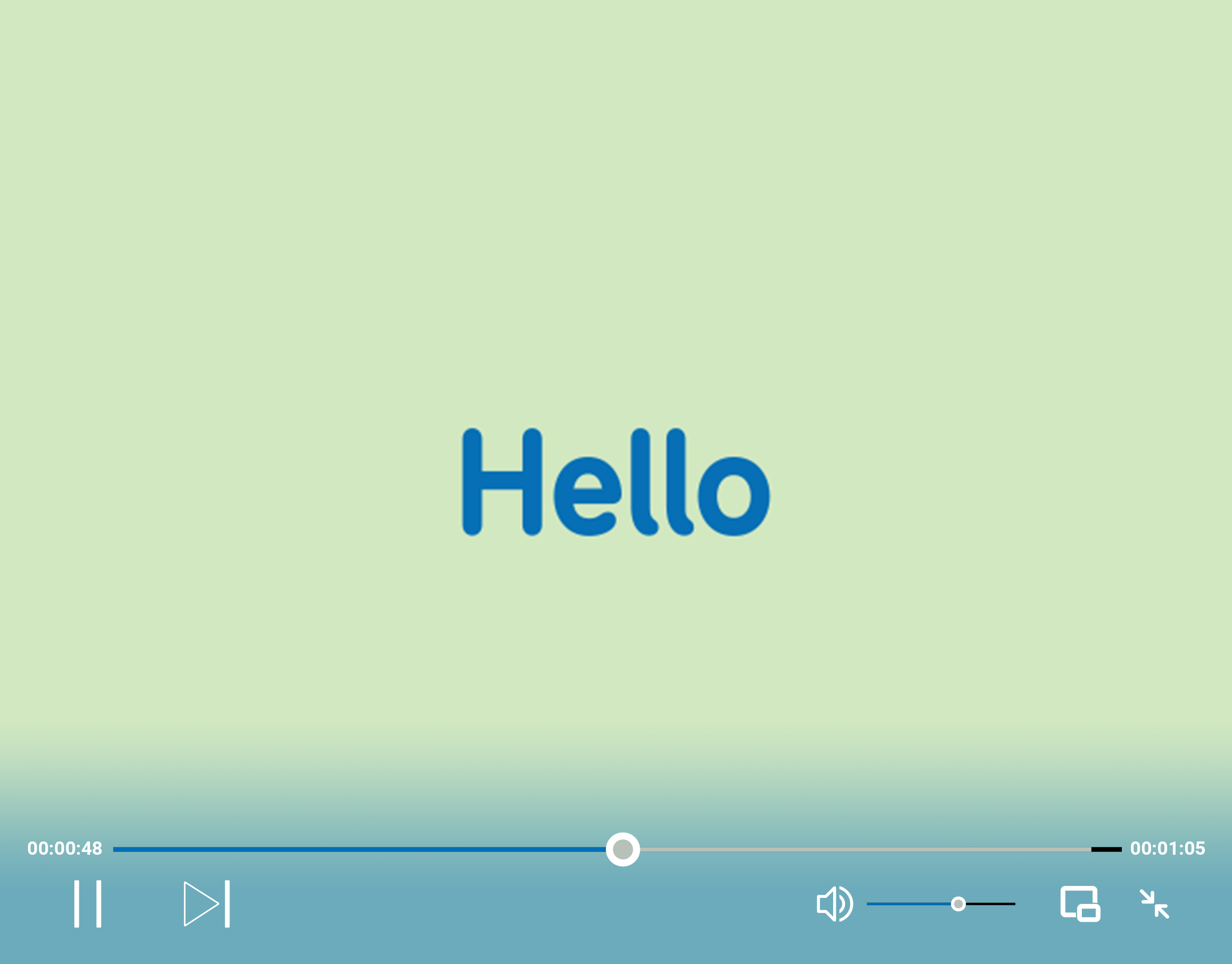
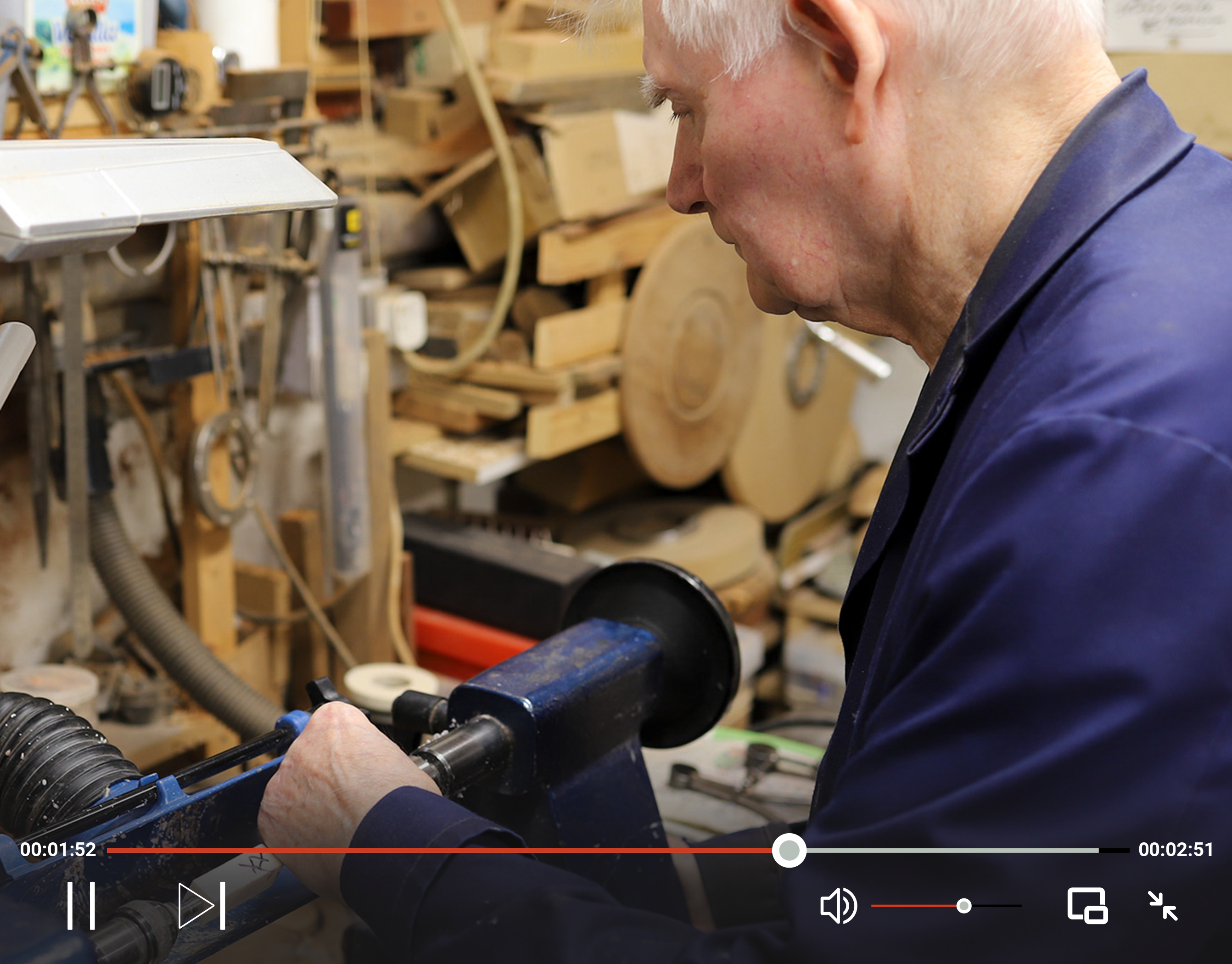
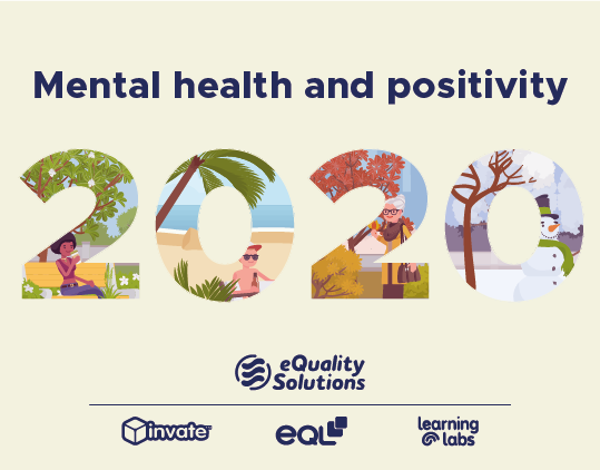
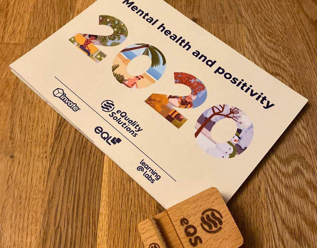
Below is an update video on what EQS' companies have been up to during the last quarter of 2020.