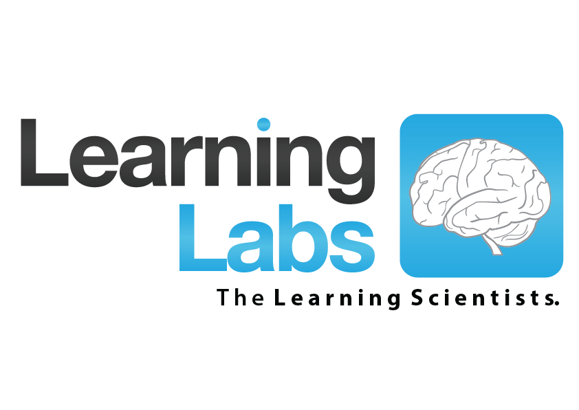
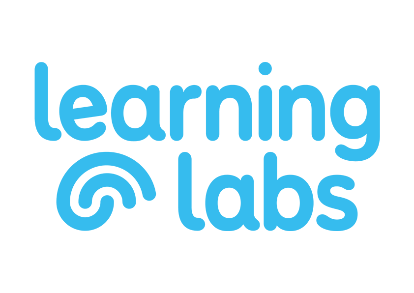
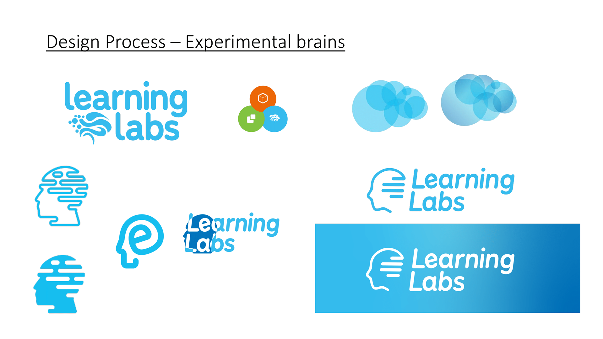
After joining a team along with another designer. We worked as an in-house team for 3 different brands, and later a fourth umbrella company for these. This led to one of our first biggest projects being a new logo for Learning Labs. The old logo had some major flaws, the biggest for the group was being how it massively differed to the other two brands. The font was very different, the other two brand had very abstract logo marks, where as the old Learning Labs logo was a very detailed brain which scaled poorly when small it just looked like a rounded square with a hole in it.
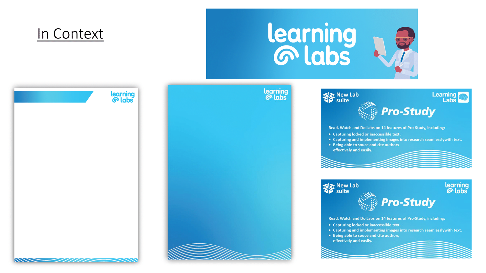
After this we changed the group branding as a whole to modernise it, and again create a singular thread between these. This thread ended up being this multiple line wave, 3 colour gradients with a matching pallet, along with our very rounded text and graphics. You can best see how all these branding changes worked together using the new logo, colours, gradients, wave, characters and icons in this landscape booklet we present to new partners titled: What is Learning Labs?
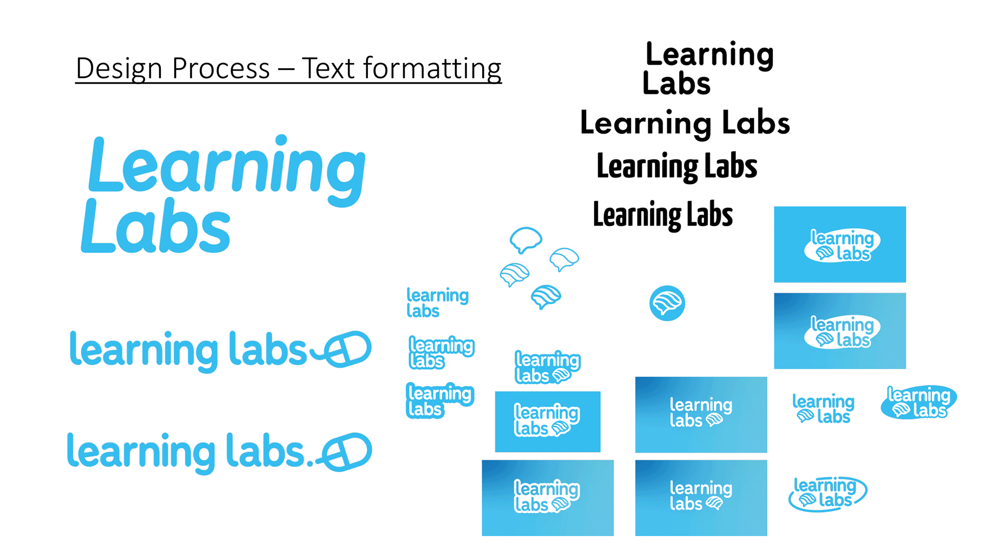
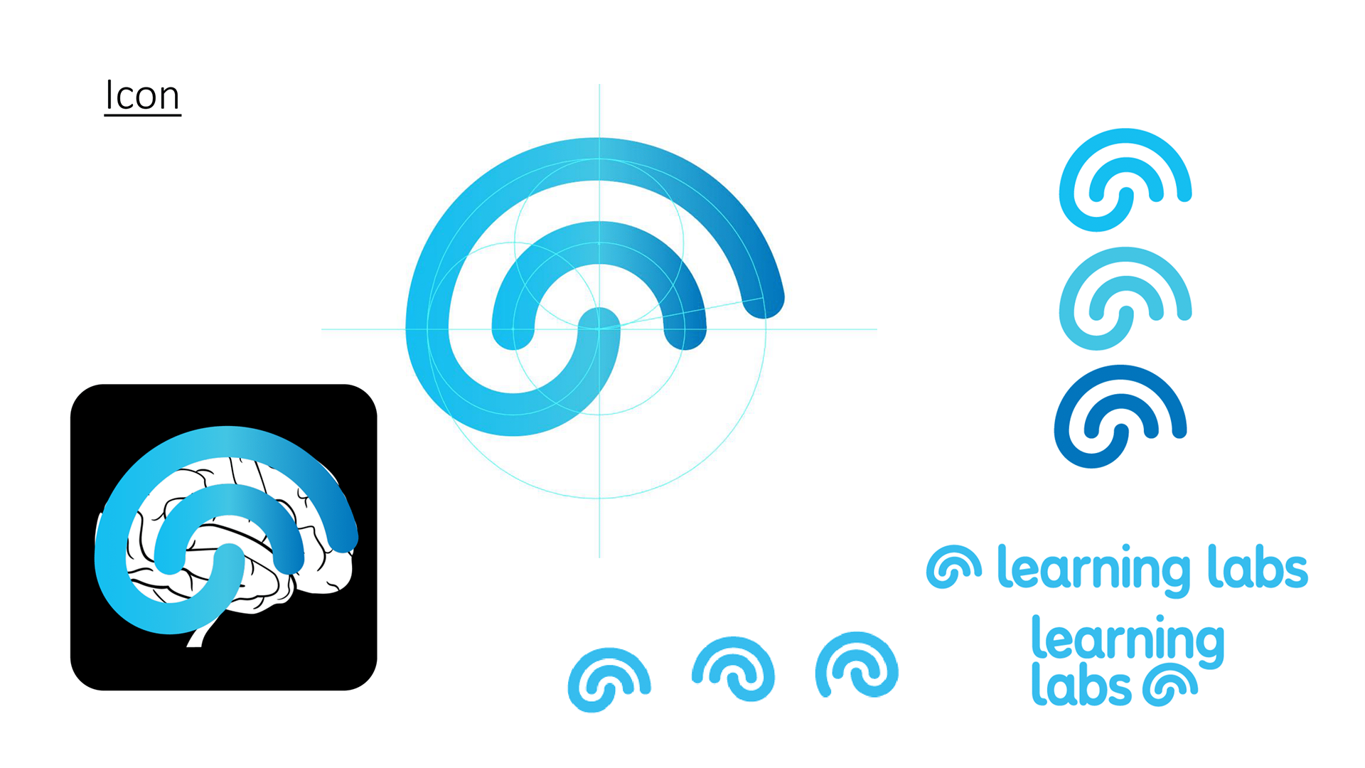
The new logo I love and so did the rest of the team. It was one of the best collaborative pieces between me and Jamie (our other in-house designer) as I worked on the typography and he worked on the abstract iconography and we unified these ideas to create this logo. After many hours of mood-boards and ideas, the transformation of this logo's before and after I think is great. The roundness, thickness, and general friendliness reflects how our company portray's itself to students and trainers and now our logo and simplified branding speaks this too.
_______________________________________________________________________
With Learning Labs redesigned, all companies using gradients and matching colour pallets —they all look great together and can stand alone.
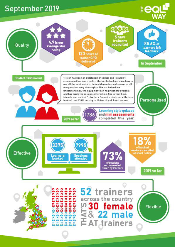
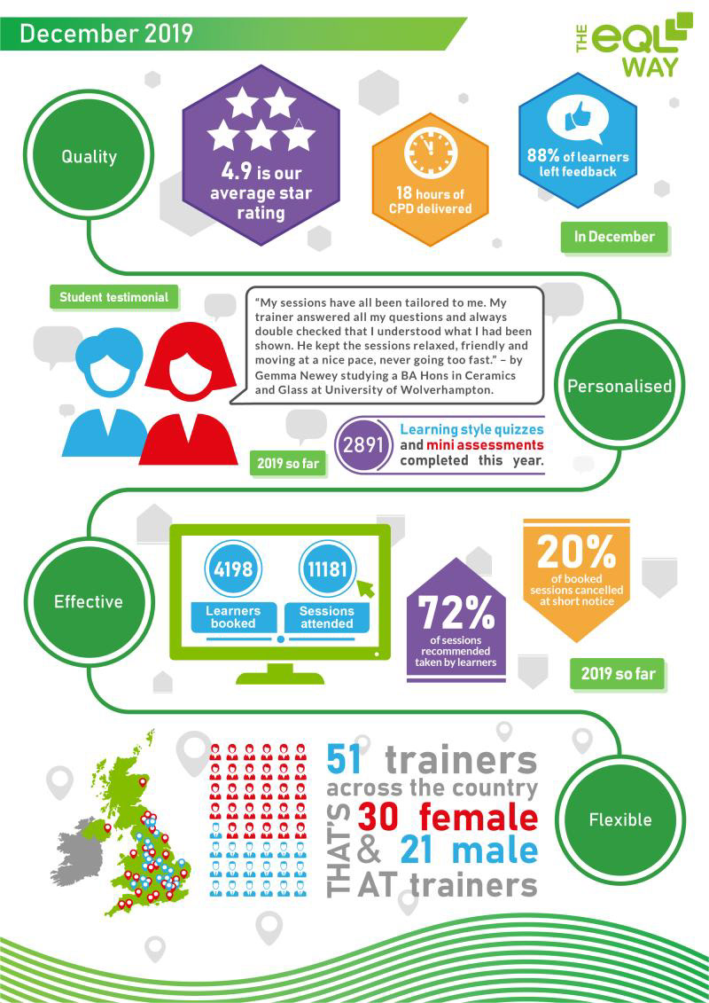
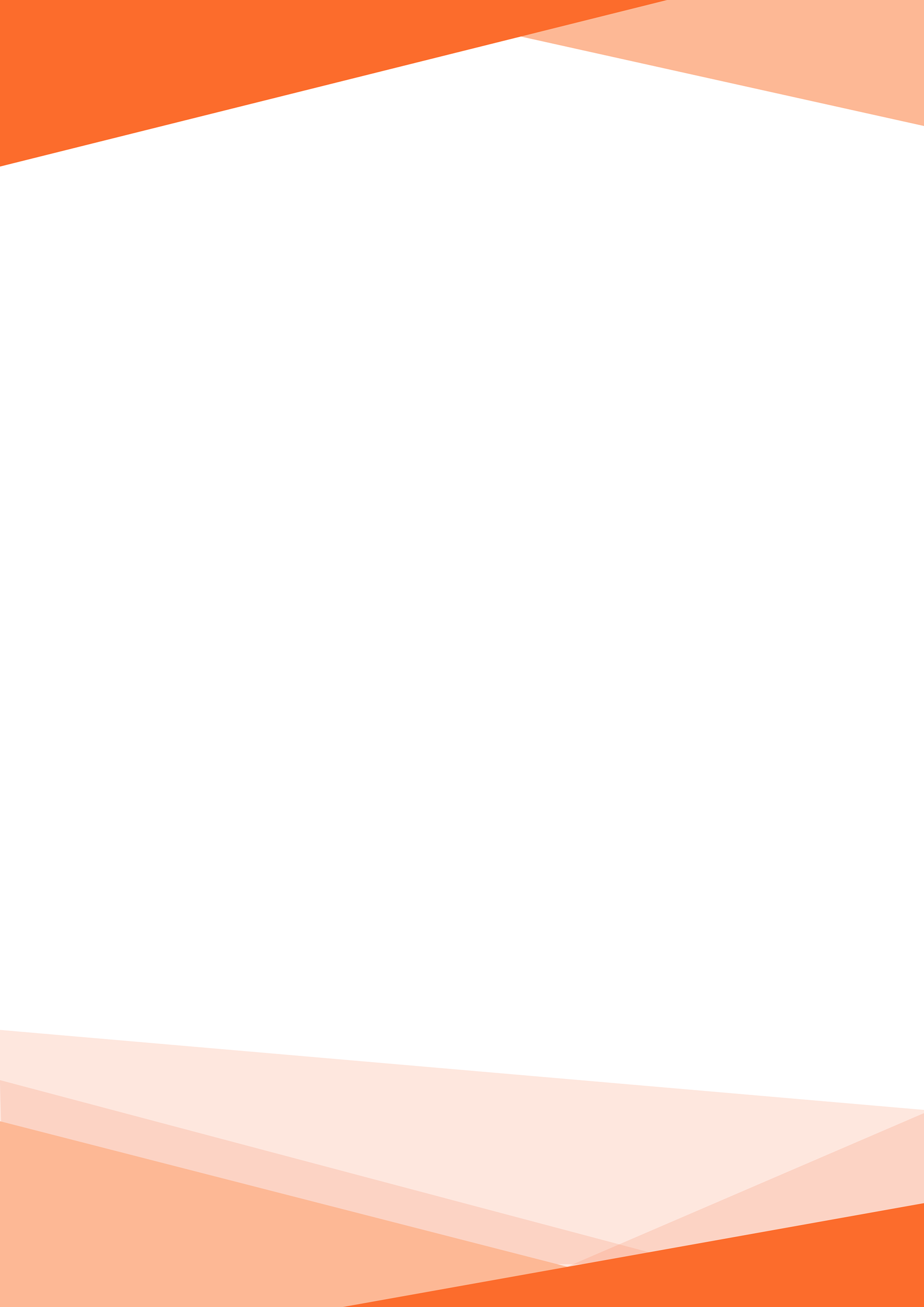
Below is a simple comparison of the new letter header and footers put on our monthly statistic posts for eQL, and below that is the blank Microsoft word document used with a before and after our designs. It's a simple before and after change in a case like this, but shows the brand re-designs universal application for all 3 brands and in all places from motion graphic outros to word documents.
