![](https://cdn.myportfolio.com/6a4adb13-cad0-49fa-8151-cad78288e074/8fc7b923-35f0-4dc8-8785-809e195b54ba_rw_1920.png?h=2b23ae721e8ab249c70d7a7ea94b8a01)
This is the final logo above. The main colour was changed to purple rather than dark blue as another one of our companies was launching a sub-brand in dark blue at the same time. All the bold purple colour sat very well alongside the other bold company logos
![](https://cdn.myportfolio.com/6a4adb13-cad0-49fa-8151-cad78288e074/d4e4ab09-2c2d-4b33-8e19-160ce2e5c576_rw_600.png?h=3f36a11422fa42e734ed99b1bbbc7448)
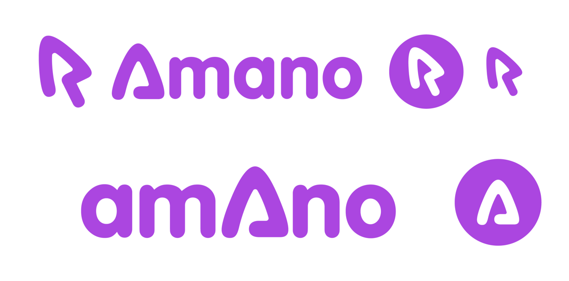
Above is what the prior logo was. You can see how this influenced the new logo where the mouse was turned into an abstract version of a mouse cursor. And then eventually integrated into the wordmark text itself.
![](https://cdn.myportfolio.com/6a4adb13-cad0-49fa-8151-cad78288e074/56aaccd9-4627-42c5-ad20-76b16133b295_rw_1200.png?h=42ee8ad8b2b6aff1034e1025928728bc)
![](https://cdn.myportfolio.com/6a4adb13-cad0-49fa-8151-cad78288e074/76ff5c84-e93d-4e6b-b5cc-b25863062809_rw_1920.png?h=04f4d17b9bd51caa1b941e9e3633689d)
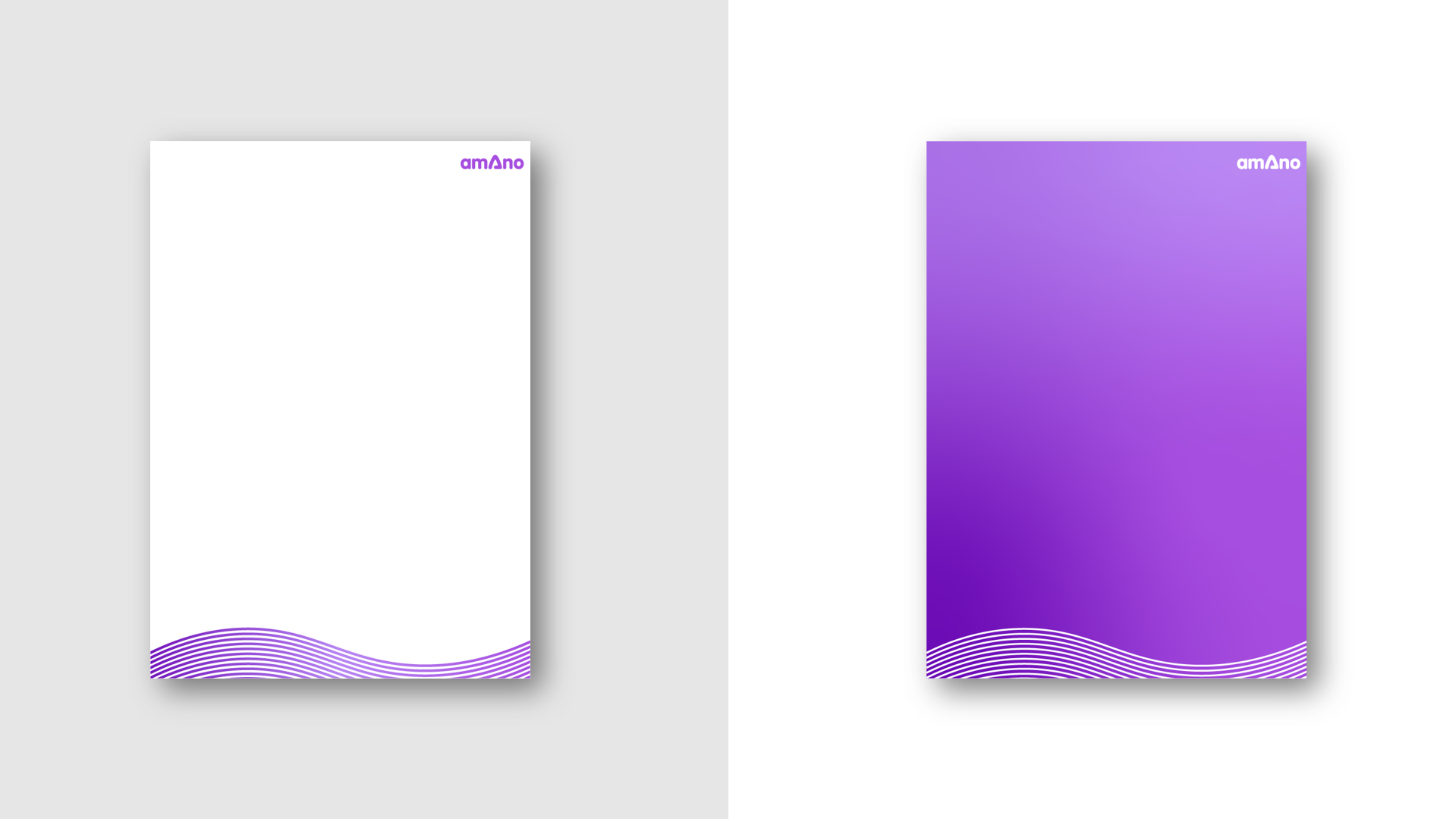
Above is how it can be used in word documents.
Lastly you can see how it sits alongside our company's other brands.
![](https://cdn.myportfolio.com/6a4adb13-cad0-49fa-8151-cad78288e074/3960020c-07ff-4a1c-aa5c-8403f06ee883_rw_1200.png?h=fb4126cdec43ef1c8a16f5d4f1e169c1)
![](https://cdn.myportfolio.com/6a4adb13-cad0-49fa-8151-cad78288e074/af29b2df-98db-4a29-8c42-b4941ca46c96_rw_1920.png?h=3b845c32995d10ad5b3b51fcd7ba41a5)