Intro to the Task
This task was given to me after a first stage interview. It was outlined in a six page project brief laying out the Task Objectives, Working Methodology, and the Agreed details of the task from the Workshop for Development.
The Main task was outlined as:
“A Customer Service Representative selling Gift Cards on a till/ePos. I want to assist the customer to be able to purchase multiple gift cards each of different values, whilst also capturing the customer details as part of the transaction. So that we have full visibility on a customer’s spending limits in accordance to Know Your Customer (KYC) purposes”
My Design Philosophy
• Some similarities do need to be made to other till/ePos systems to give a user experience that feels familiar and intuitive.
• Not afraid to redesign how users think of till/ePos systems. Many still look very outdated, especially with the role smart devices now play, and how UI design for phones and tablets have been modified and updated ten folds.
• Reduce the amount of sub-pages to a minimum for a more intuitive design which involves less steps but fulfils all required tasks.
• Placement of top left for the first used task of that page. This is the area where people first look at a screen due to how we read, and is the user is most frequently going to click.
• The “journey” buttons (buttons at bottom left and right), placed to be similar to reading a book left goes back a page and right goes forward a page. The back button is made small as less likely to be used, and confirmation button is big with informative text. (Confirmation button could even have a double press function as to avoid miss clicks).
• Due to the user frequently using the system, I opted for in-line information rather than traditional invasive ‘pop-up’ notifications which slow down user functionality.
• I choose a 3:4 resolution, as from my research most displays appeared to be this format.
• Cutting down on colours and gradients from traditional till/ePos systems to both look and function better.
• Chosen font was clean and professional but also friendly, and it’s thickness was key as it should be easily readable on the till/ePos displays.
Lastly to Note
• My inexperience in using till/ePos systems, as such knowledge in that field is limited to brief research and details provided in the project brief.
• My document was made to be concise but detailing all aspects from the document which is confidential. Using bullet points to explain each step of the agreed details, describing what is displayed in the mock-up designs.
• Efficiency and ease of use for the user is top priority over aesthetics, as in a task such as this being not a direct consumer product, but used frequently by the user (Customer Service Representative selling Gift Cards on a till/ePOS).
• This is a first mock-up where the layout and my descriptions are paramount. Functionality can be refined through testing, and more so designs, fonts and colours can also be modified.
• Current ePos systems are still basic in terms of functionality, no swipe gestures and inaccuracies in the touch screen have lead me to go primarily for large buttons making them easy for users to press.
• All names (especially the titles) are simply placeholders and only used as reference points to functions from the brief.
• Numbers in square brackets, e.g. [0] refer directly to the numbers listed in the ‘Agreed Tasks’ list from the Workshop for Development document.
First Screen
• Shown to the user after selecting ‘buy a gift card icon’ [1]
• Gift card tile goes blue once selected by user [2].
• I originally opted for just 4 gift card price ranges, however it would be simple to add a number pad if users require to enter exact amounts [3].
• White background, each option could either be a large box with the card name, or show specific branding for each card to easily make easily recognisable and mirror the real card, I opted for a different shades to differentiate the tiles for the mock-up.
• I opted for the highlighted blue to demonstrate which is selected for the current price value.
• Colour consistency is important for functionality as it signifies to users clearly which boxes are clickable and which are not.
• A condensed tender screen is displayed on each page on the right, this is updating with new information and is a clear list of what cards are being selected.
• The confirmation button is in the bottom right as it is the opposite of navigation to the back button in the bottom left, and would be the last area of the screen a user would go to [4].
• The confirmation button could only appear once at least one card has been selected and given a value.
• The X in the top right is static and to fulfil [Exception 8] to cancel the whole transaction at any point.
Second Screen
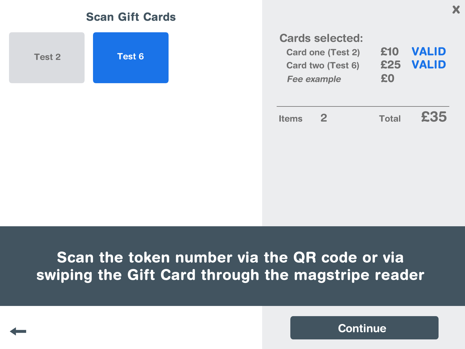
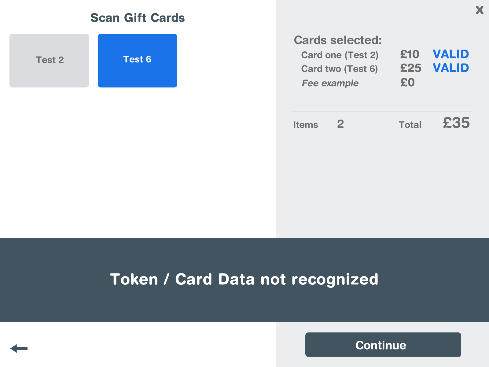
• The options of cards have been reduced to only the card selected.
• This screen follows a similar user journey as the last page, the user selects which card is going to be scanned, before being notified in the large information box to scan the card [5].
• This box is a permanent fixture on this page to notify the user of what the system is doing, for example it could display ‘scanning’ while reading the token number, displaying when it has been read into the till/ePos [6], and for [Exception 1] would display when not recognised.
• A blue valid tag will be applied to the card list, [7] similarly a red invalid tag could be added if the scanning has failed.
• Once successful the notification box will prompt the user to add the next card [8]. Which can be repeated until all cards have been scanned [9].
• The summary of the cards stays on the right and displays any fees added [10].
• Continue button will only appear once all selected cards have been scanned [11].
Third Screen
• My limited knowledge with Fair Processing Notices and GDPR led me not to display it in the mock-up but depending on length could just be displayed by itself before this page [12].
• I decided to combine the sub-steps of [13a-i] and [14c-f] in order to streamline the user experience, as even though the system only needs name and email/phone for the marketing preferences there is no need for the user to enter the same information twice.
• I opted for blank lines over boxes for the information form as the clickable section due to the different requirement of needing to type in the information, not one click.
• A look-up button is beside the address section for UK address’ to find from postcode [13d].
• For the marketing preferences [14a+b] I choose multiple choice buttons over single tick boxes, as the default positions of ‘opt in’ for 1st party and ‘opt out’ for 3rd party in accordance to how it is described in the Fair Processing Notice/GDPR, it could be replaced by yes/no to be simpler for the user. The information icon can display more details of the Fair Processing notice if wanted by the purchaser or user [12].
• This keyboard design is a placeholder as it’s layout is borrowed from the iOS keyboard, and simply to demonstrate functionality. It may also be unnecessary if a physical keyboard is attached to all till/ePos systems, otherwise the onscreen keyboard is a necessity for entering the purchaser’s details.
• The flexible tender information on the right is repeated again, and can move in accordance to any fees added, which can notify if an Issuance fee has been applied [15].
• Again, the continue button will only become usable once all required/mandatory information has been entered [Exception 3].
Fourth Screen and Final Log Screen
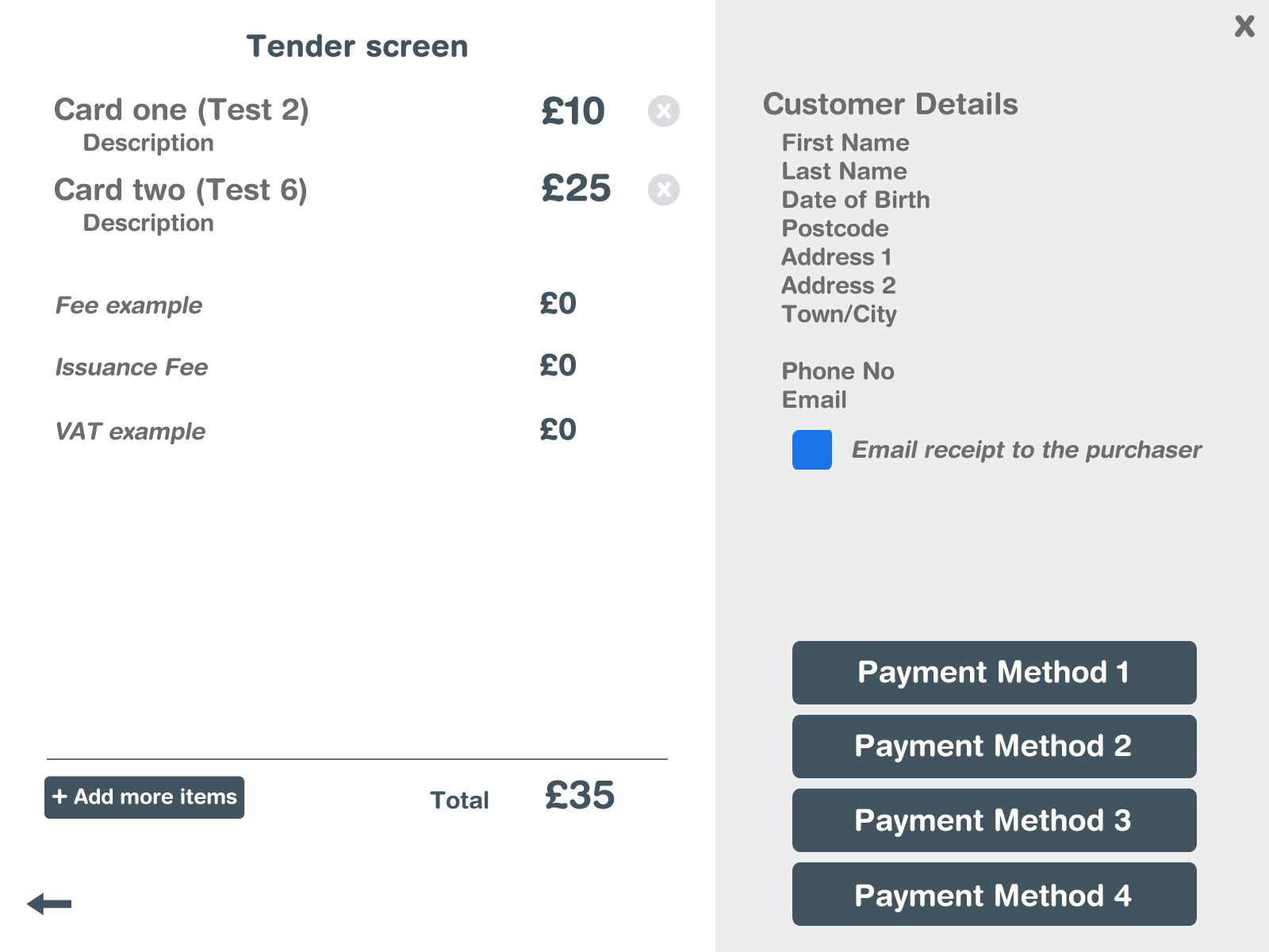
• Tender screen is very simple, the information that has so far been displayed on the right has moved to the main screen and expanded with extra detail.
• Small ‘x’ icons are placed next to each card to be able to delete the item [17].
• I also opted for an add more items (or cards) button, this would take the user to the first and then second page, which would aid in easily adding multiple more cards at once if a purchaser might decide they want more than one [17].
• All information is displayed, in the top left [16a], bottom left [16b], and top right [16c]
• Where the continue button was, multiple payment options are now in its place [18] and go to different steps based on the various payment methods [19].
• I decided to place [22], email receipt to the purchaser, as it is the sort of question you would ask either before or while choosing payment options, however could also be easily added to the last page. An option for text message receipt could also be possible.
• An alert can also occur here for an exception if the user selects an email receipt but has not entered an email address on the previous page due to it being optional.
• This also begs the question if emails should be optional, as if the purpose in the user story is for “full visibility on a customer’s spending limits” and KYC, I’d argue email marketing more so than postal.
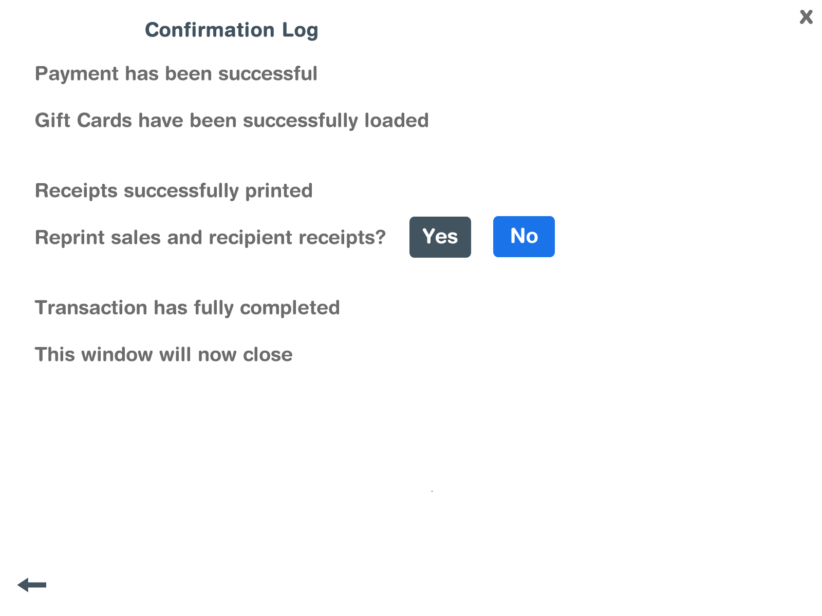
• This Last page is entirely for functionality, it’s a text log of what the system is doing and would come up one by one. It likely could start with the success of the payment option chosen, maybe having to go back to the previous page and select a different option if failed [Exception 5].
• User is presented if the first receipt has been printed, or if any problems occur such as the printer failing it will be displayed here [Exception 6].
• When successful [20] it is displayed to user, along with Gift cards successfully loading [24] as seen in the mock-up.
• The option to reprint the receipts [23]would appear here with small yes/no boxes, and similar to previous pages would go blue on selection.
• Once the option has been selected and printed the user will be notified that the full transaction has been completed [25], before waiting a few seconds before closing [26].
User Map Journey
Though familiar with user journeys, I have never mapped it out. Hopefully it was self explanatory from the mock-ups, however I added this map/diagram which may be easier for the team (developers and the workshop for development) to visualise each page as a step.
This is a succinct insight into my design process. I undertook this by first making a quick plan of ideas from the agreed tasks working out how pages would be divided. I then began on the mock-ups trying to keep the designs consistent throughout, having all pages up and slightly modifying them as new ideas came about from later pages. Before lastly writing up all my ideas in this document to explain what was in each image in more detail, and to discuss in relation to the brief. I believe this would be a great first visual of the project for the developers to start work on, and can be further refined through discussion with the team.
I later discussed the project, my design process, and my ideas further in the interview.


